Login
EdTech.
Overview
The Project
This project is about re-designing the Sign In | Login feature for the web and mobile educational apps at Declara, Inc. The designed feature was released online and was part of a series of iterations where I also participated.
The UX work presented here is done by me, in collaboration with a design team that included the Design Director, a UX Senior Designer and a Visual Senior Designer.
What I Did
Ideation - Sketches
Low fidelity wireframes
High fidelity wireframes
High fidelity visuals
High fidelity clickable prototypes
Interactive prototypes with compete flows and micro-interactions
Problem
The initial versions of the app only asked for an email and the company was missing a unique opportunity to greet, connect and get to know the new users. A memorable first impression translates into users coming back, promoting and sharing the app. B2B|B2E accounts were created when they were pre-loaded to the system. This meant that we couldn't greet users, set them up correctly or link with them via social media.
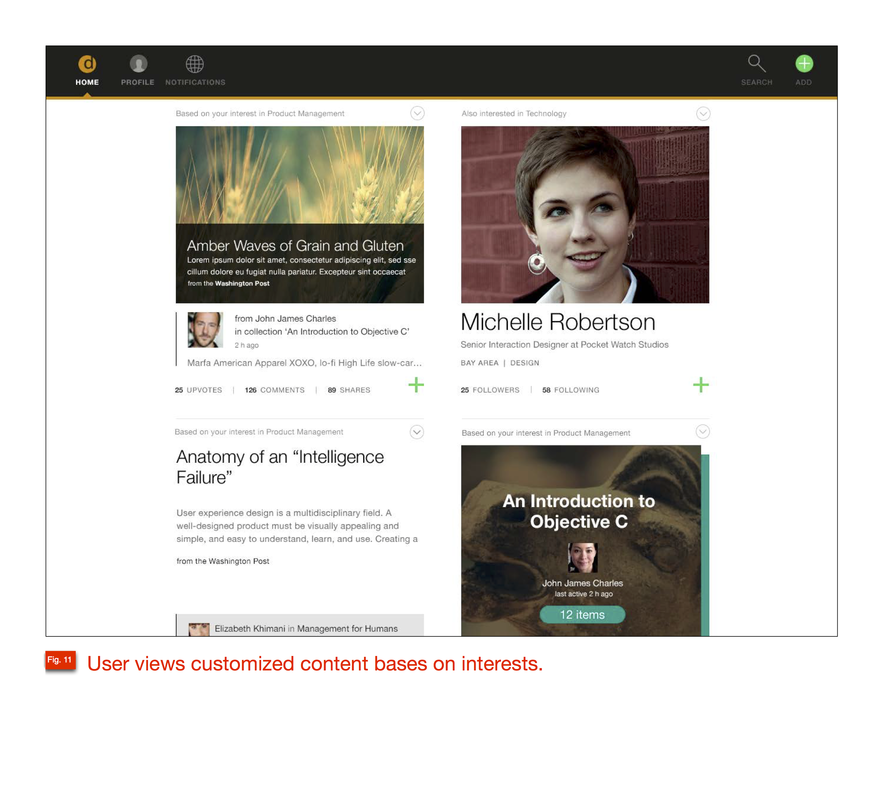
The new approach for the app was to create a social Sign up flow and to include a questionnaire to lean more about the user's personal interests and skills. The social Sign Up also provided the company with an insight about the user's journey and evolution. By following the user, the company is able customize a more enjoyable experience.
Process
Step 1 - Framing
The product team comprised by the Product Leads [2-4 people] and the Design team [2-4 people] met to define and analyze the new Sign In | Login requirements.
I reviewed and analyzed the Sign In | Login specs and requirements defined by PM lead.
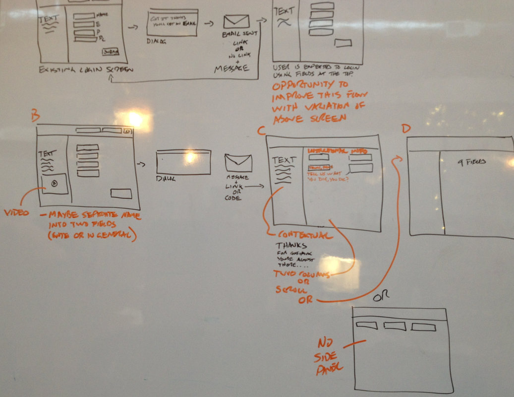
Step 2 - Sketches & Comparative Analysis
I analyzed competitors and sites that use similar Signup | Login flows Pinterest, Asana, Simple, InVision, Evernote, Instagram, etc.
Reviewed use cases and researched best practices, patterns, and guidelines.
Defined Sign In | Login flows and interactions with different options to evaluate with the Design Team and Product Leads.
Used whiteboards and lo-fi sketches to present, iterate and brainstorm requirements for both the web (browsers) and the mobile apps (tablets, phones, and smart devices).
Step 3 - Wireframes
Created wire-frames for the Sign In | Login architecture and flow.
Created wire-frames to describe the Sign In | Login interactions, states, and errors.
Collaborated with teammates to share, complement and go over design ideas.
Step 4 - Visual Design
Created visuals for the Sign In | Login screens, asset libraries, state options, and interactions.
Reviewed visuals with the Senior Visual Designer.
Helped creating interactive presentations for investors and stakeholders demos.
Step 5 - Interactive Prototypes
Created Sign In | Login clickable prototypes to facilitate communication with engineers and stakeholders.
Tested interactive prototypes with the Design team.
Step 6 - Delivery & Follow Up
Shared and discussed UX and visual designs with peers, product leads, engineers and stakeholders.
Collaborated with engineers to troubleshoot issues and solve problems.
Followed the process and road-map by going over the progress, requirements, and deadlines.
Desktop Flow
Design Based on Whiteboard Sketches
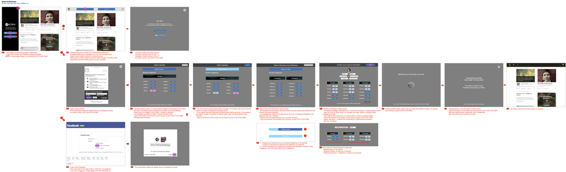
Complete Login. UX Flow
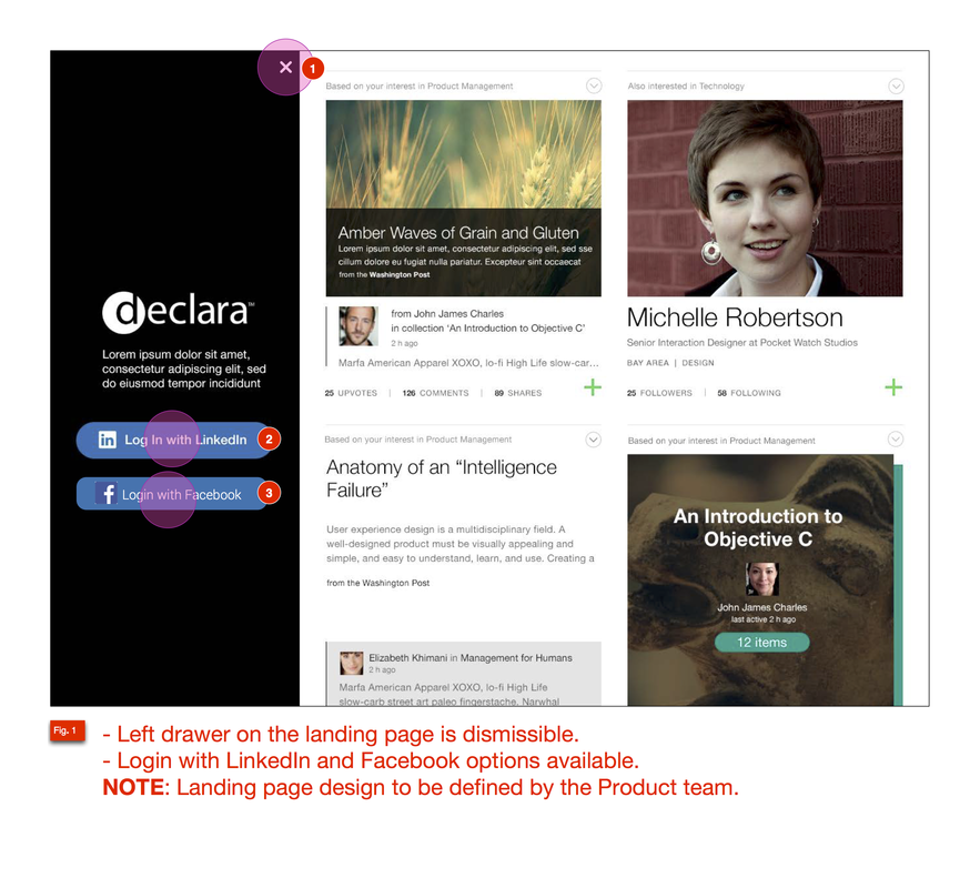
Login Landing Page with Login Drawer. High Fidelity Wire
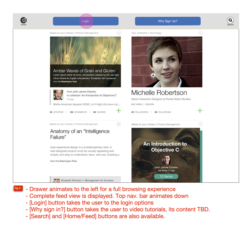
Landing Page with Top Nav Login. High Fidelity Wire

Login Options

Login with LinkedIn
Login
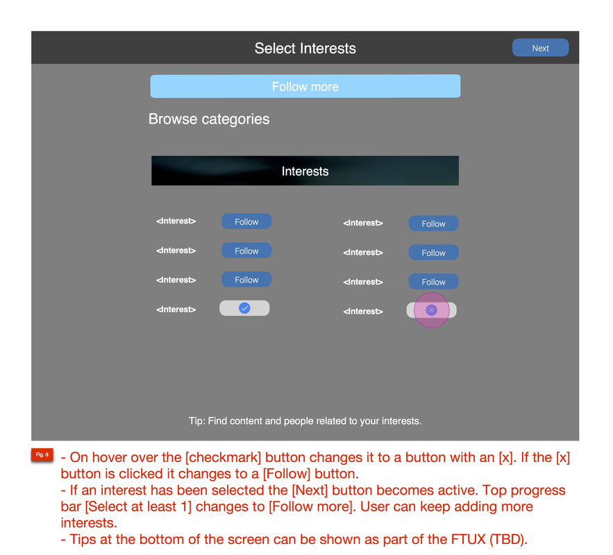
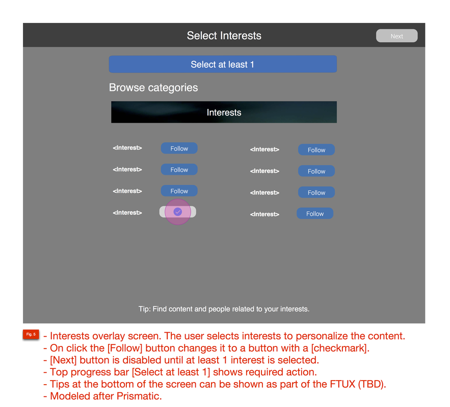
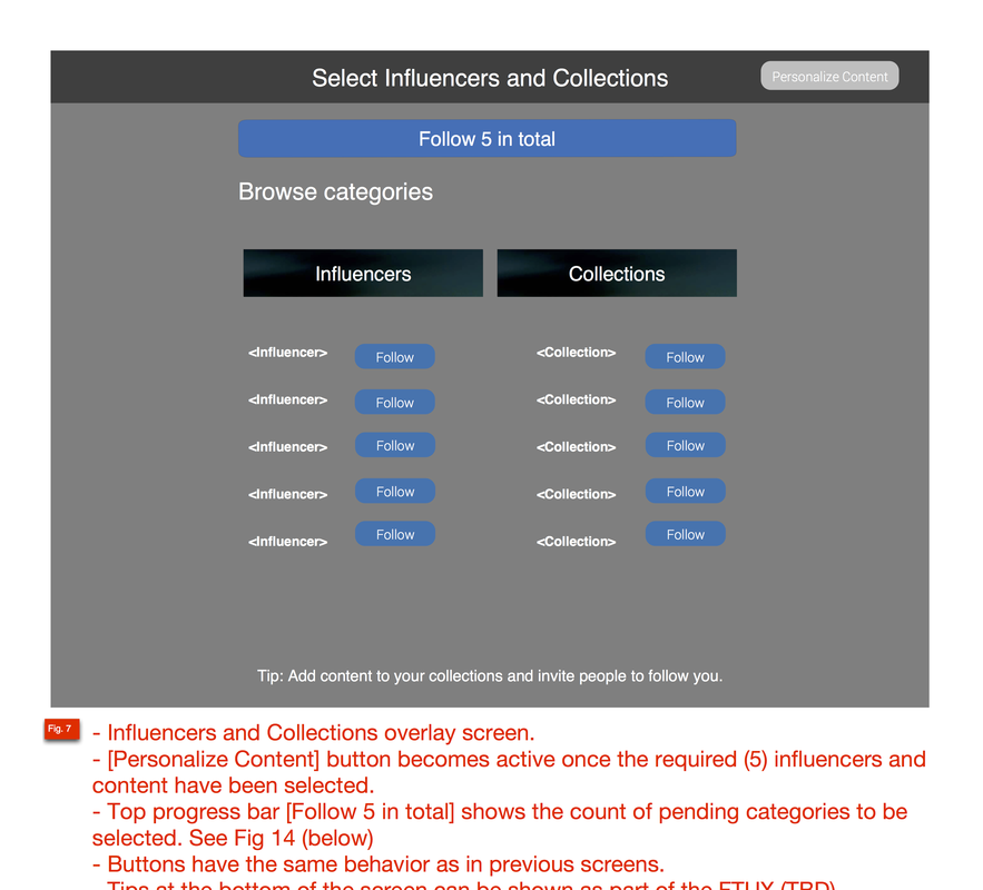
Interests Overlay Screen
Profile Info. Confirmation

Profile Confirmation Overlay
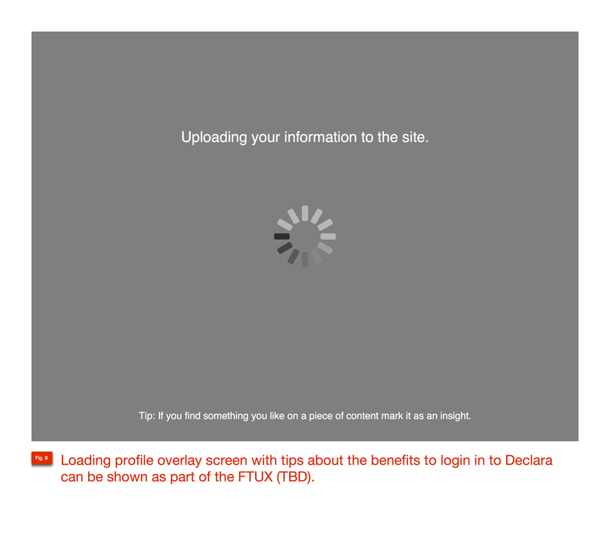
Login Loading Page

Welcome Overlay Screen
Logged In State. Feed. High Fidelity Wire
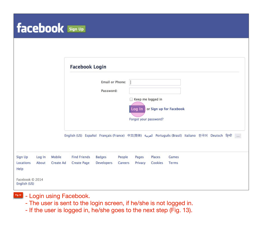
Login with Facebook Flow

Login with Facebook Flow
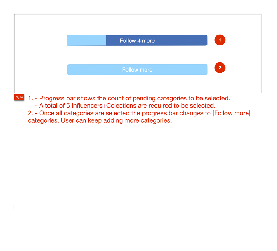
Progress Bar. Login Flow

Error State | Profile & Login Flows
Requirements & Mobile Flow
Specs, Requirements and Use Cases


Solution
As a result the Sign In | Login was released online.
Developed an easy to use and straightforward Sign Up | Login flow for the user.
Reassured users that their privacy and sensitive data was secure.
Helped users reset passwords and reduced pain points that happen when you loose your password.
Created simple forms with relevant information to prevent frustration and unnecessary error messages.
Used discrete and fun interaction, error states, cues, etc
Reduced friction by minimizing user clicks and excess pages.
Increased conversion, time of use and retention.
Promoted content by asking easy and short questions about interests and skills.
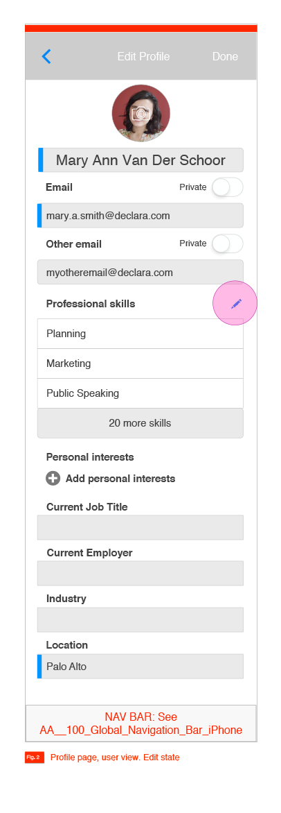
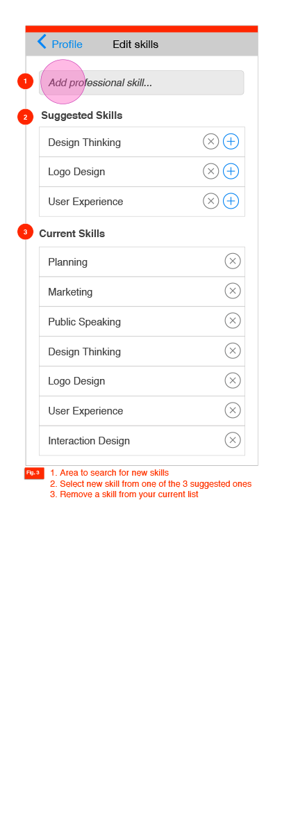
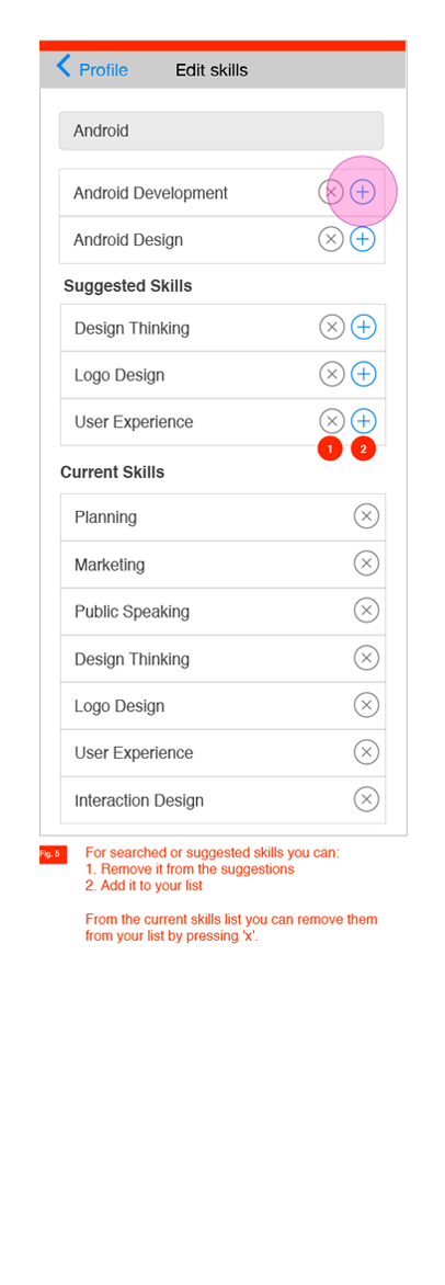
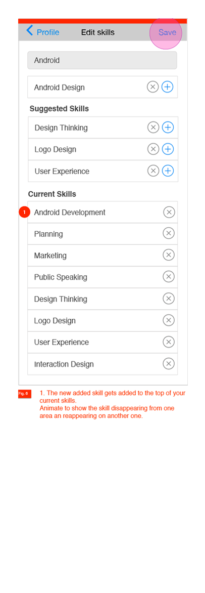
Improved the Profile feature by including the gathered information and the social media data.

