E-Commerce
B2C.
Overview
Project
This project was a design challenge for Wells Fargo. I was an the sole designer for the redesign task.
What I Did
Review the current design and describe any visual, usability, and/or accessibility issues, errors or improvements in the current design.
Add loyalty aspects to the current application.
Starting Point
Flow and starting screens provided by Wells Fargo.


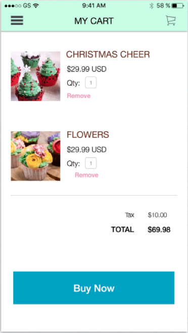

Reorganize and simplify the profile page. Added the functionality to change the photo.
Went over the flow and provided issues during reviews.

Analyzed multiple e-commerce apps like Zappos, Zuiliy, Poshmark and Amazon.

Analyzed multiple e-commerce apps like Zappos, Zuiliy, Poshmark and Amazon.

Analyzed multiple e-commerce apps like Zappos, Zuiliy, Poshmark and Amazon.
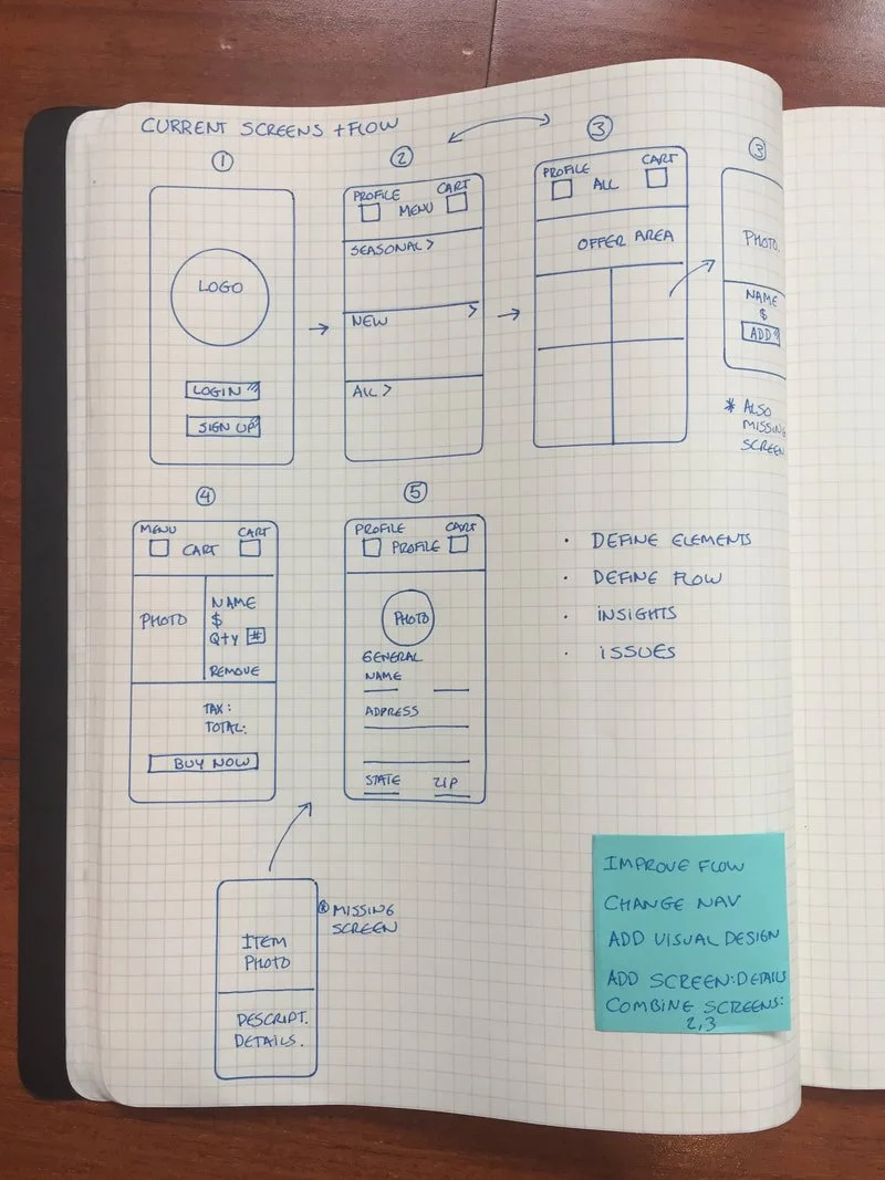
Flows
The initial flow had multiple issues. The common flow on an e-commerce app (i.e. Amazon) is:
The person downloads the app
The person looks at the catalog of products to decide it he/she likes the products offered in the app
If the person likes the products offered he/she can create an account using the profile tab (Flow 1 to create an account) OR
If the person wants to purchase a product, he/she would add the item to a cart and from the cart flow he/she can create an account (Flow 2 to create an account). For security reasons and to help with future purchase you want a user to create an account when purchasing a product.
Initial Flow
Person Signs In
Person sees the product groups
The person sees the catalog and adds a product to the cart
The person purchases the product from the cart

Final Flow
The person sees the catalog to decide if it has what he/she is looking for. Users should not be required to create an account as the first step of the process. Combined screens 2 and 3 from the previous flow using a tabbed approach to simplify the catalog.
Added a screen for product details because users need to know additional details, like nut allergies, gluten free...
The person sees the catalog and adds a product to the cart.
When the person is ready to purchases the product from the cart it is asked to login or sign up.
Once the user has logged in he/she can finish purchasing the product (just like in tools like Zappos, Zuily and Poshmark).
When creating the account the profile page gets populated.
The key elements redesigned were:
Application flow and architecture.
Simplified catalog screens with tabs.
Added search functionality to locate products easier.
Moved the menu location and fixed the system header.
Improved visual design including fonts, sizes, color contrast, etc.
Added pages for product details.