Data Visualization
Big Data.
Overview
What I Did
This project was for Unifi Software. The main goal was to give the users the ability to see data objects in one place. By seeing them in one place they should also be able to see the details and the relationships between them.
I was the lead designer for this project and worked in collaboration with a design team that included the Director of Engineering, a UX and a Visual Designer.
Research
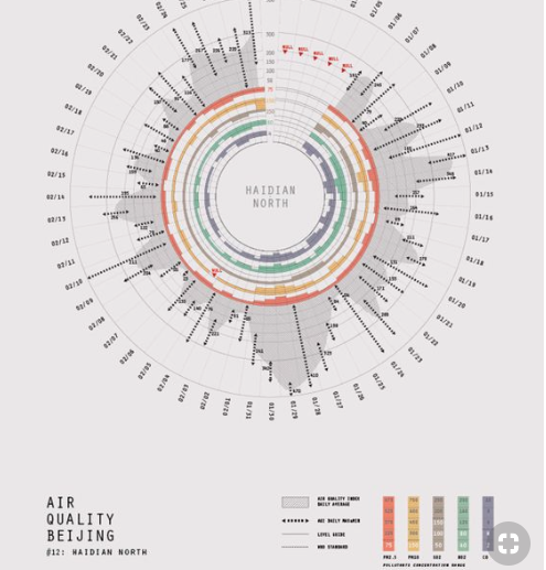
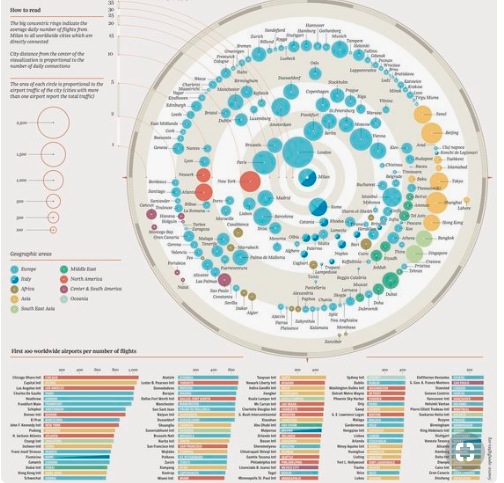
This project required a lot of research to understand the different data visualization options, competitor platforms, engineering limitations and incorporate all these constraints in the dashboard design.
Leadership
I was the lead designer for this feature. Collaborated with other team members and cross-functional teams for final approval.
Process
This story came from the project manager based on feedback from the field.
The initial problem was to help users view a complex mesh of data, understand its components and relationships.
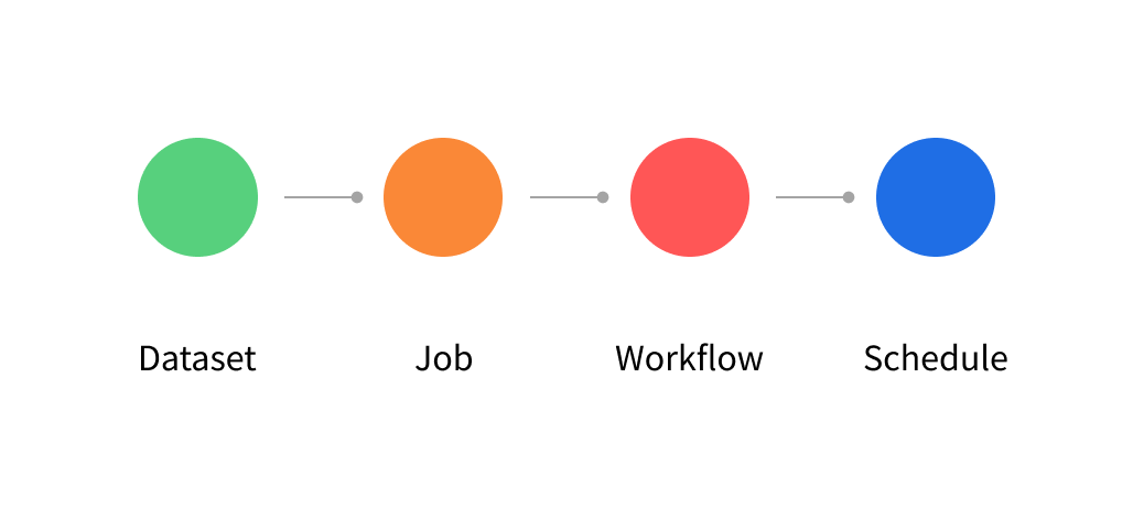
In the big data space for preparing and cataloging data you have columns, data sets, jobs, derived attributes, metadata, workflows and schedules.
Main Screens
TABULAR VIEW
GRAPHICAL VIEW

Research
Design explorations for data visualization, navigation, and layout.


Exploration
Designed the concept sketches and hi-fidelity mock-ups with flows, interactions and visuals. Created animations for engineers to explain behaviors and transitions.


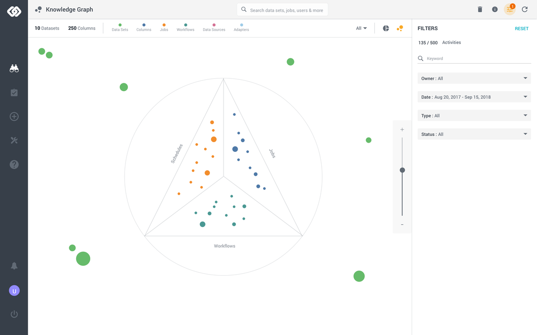


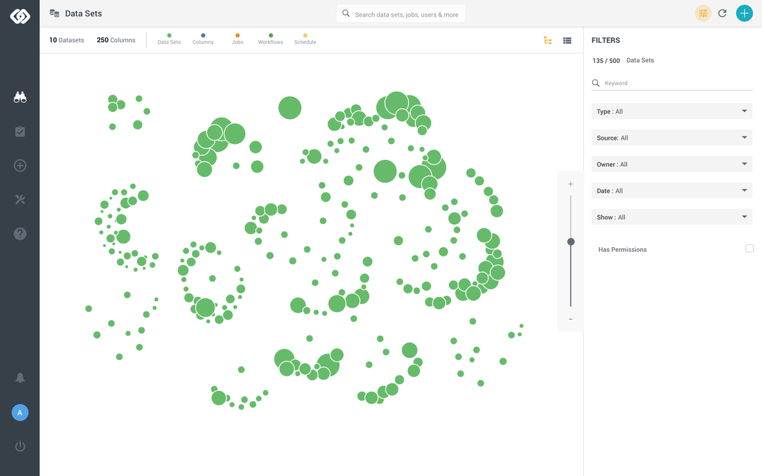
Solution
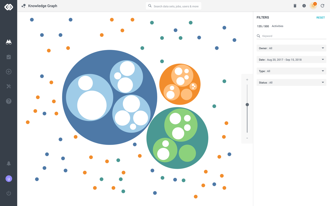
After a series of iterations and research I solved the issue by using an atom approach. There you can zoom in and out of a universe of elements to see the activity, relationships and components in one view.
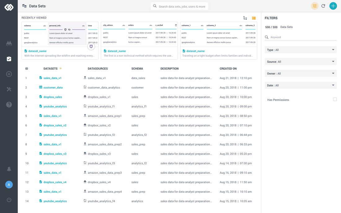
Screen 1 - Tabular View
Screen 2 - Dataset Graph View

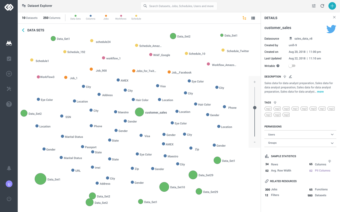
Screen 3 - Dataset Zoom In View

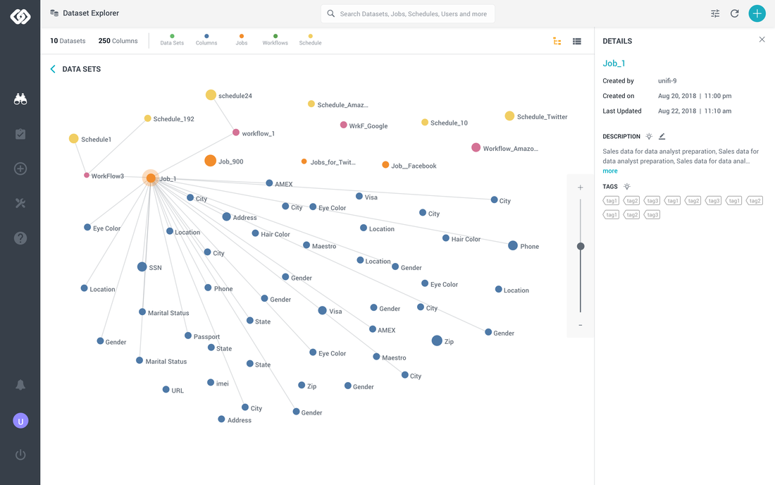
Screen 4 - Hover over state for 'Jobs'

Screen 5 - Filtering for 'Workflows'

Screen 6 - Filtering for 'Jobs', 'Workflows' and 'Schedules'