Navigation
Big Data.
Overview
What I Did
This project was for Unifi Software, a big data application for enterprises like Visa, Nike and Disney. The main goal for this story was to simplify the navigation to make it easier and faster to use.
I was the Product Design Lead for this feature and worked in collaboration with a design team: the Director of Engineering, a UX Designer and a Visual Designer. I also collaborated with cross-functional teams for final approval and release.
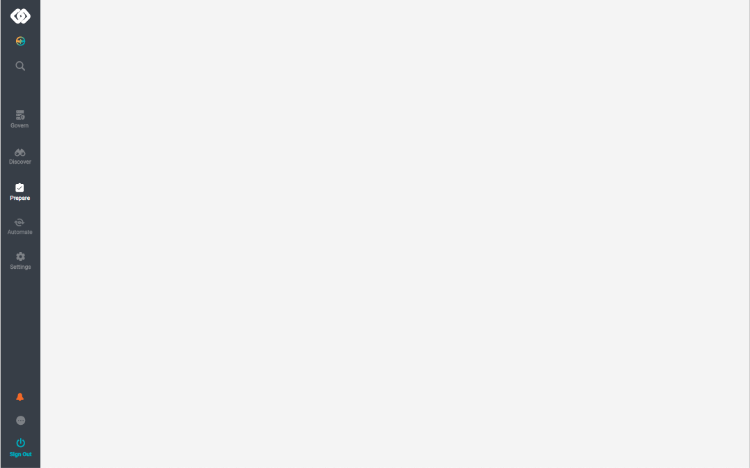
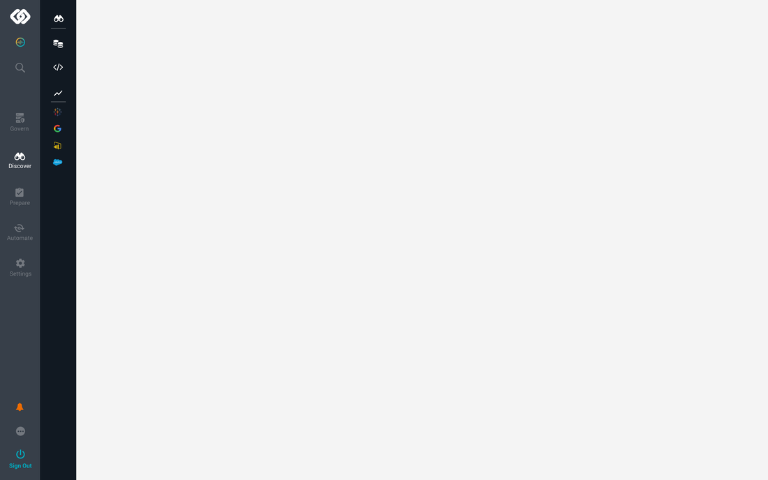
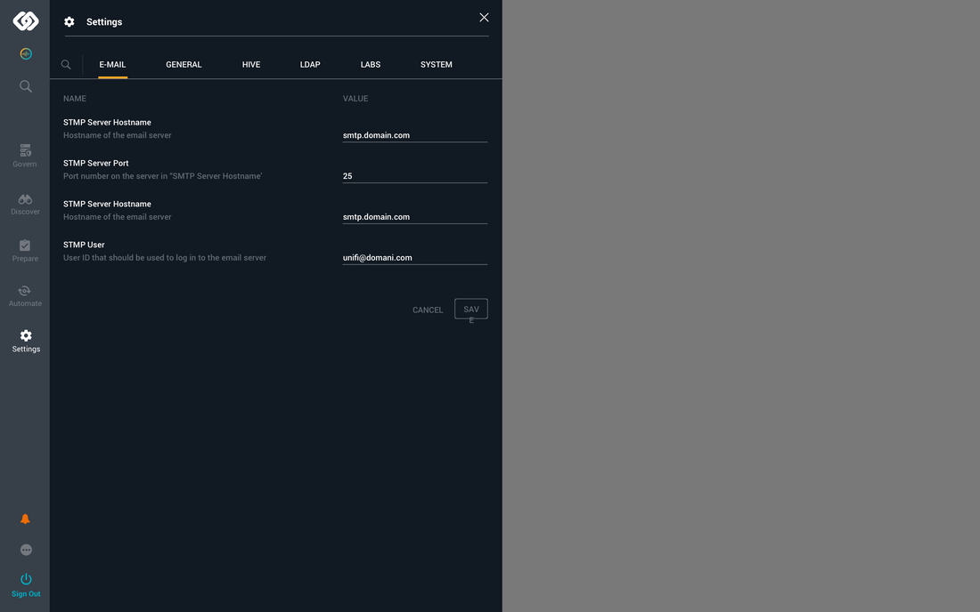
Main Screens
I created multiple solutions using hand drawn sketches and hi-fidelity mock-ups with flows, interactions and visuals. I also created animations for engineers to explain behaviors, timings and transitions.
The key elements redesigned were:
Display for hidden, shown and animated text
Icon representation, anatomy and sizes
Icon states for hover, active and inactive behaviors
Spacing between elements, areas and icons
Nav organization and grouping related to the similar tasks, objectives and flows
Behaviors for sub-menus, modals, side panels and pages like the dashboard
Starting Point: Analyzed different menus and interactions used for enterprise applications. Main tools evaluated were Jira, Dropbox, AWS and GDrive.

I created multiple solutions using hand drawn sketches and hi-fidelity mock-ups with flows, interactions and visuals. I also created animations for engineers to explain behaviors, timings and transitions. The key elements redesigned were: 1. Display for hidden, shown and animated text 2. Icon representation, anatomy and sizes 3. Icon states for hover, active and inactive behaviors 4. Spacing between elements, areas and icons 5. Nav organization and grouping related to the similar tasks, objectives and flows 6. Behaviors for sub-menus, modals, side panels and pages like the dashboard


Lessons
Through the design process, modifications had to be made in the following areas:
Reorganized icons because hover over interactions triggered the wrong panels and animations.
Fine tuned the timing of animations because sub-menus had multiple animations at once for both text and icons. Although all sub-menus had the same timing some 'looked' faster than others because of the number of items per menu (most sub-menus had 3, one sub-menu had 10).
Increased the hover over areas close to the icons so it was easier for the user to interact.
Replaced icons because they were not communicating the correct message. Some icons used didn't follow the style guidelines so I edited existing icons and created new ones.
Removed the icon text over to reduce noise, make the application cleaner and reduce the redundancy.
We got positive reactions and feedback after conducting usability testing. The changes were noticed by the users right away, they loved it. Using hover overs instead of clicks made the application easier to use and more intuitive. The application was organized a lot better based on importance, activity and flows.